
Living Room Color Schemes! Your living room is the heart of your home, and the colors you choose for it set the tone for your entire space. While bold, trendy hues can make a statement, they often fall out of favor quickly. For a design that endures, classic color schemes offer timeless beauty, adaptability, and effortless elegance.
Below are 10 living room color schemes that have stood the test of time. Each one blends style and versatility, providing a beautiful backdrop you won’t tire of. Plus, you’ll find helpful tips for styling and updating them to keep your space feeling fresh.
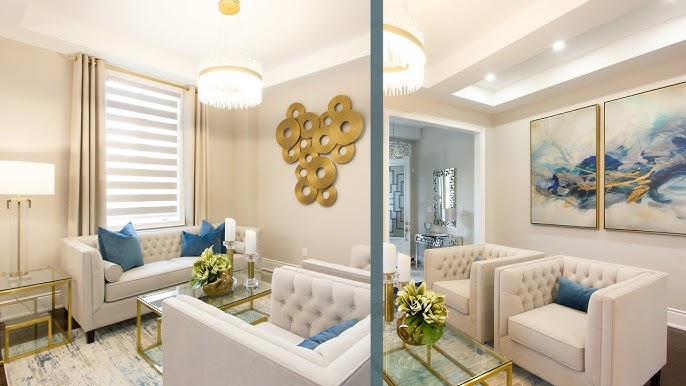
1. Classic Neutrals (Beige, Cream, Taupe)
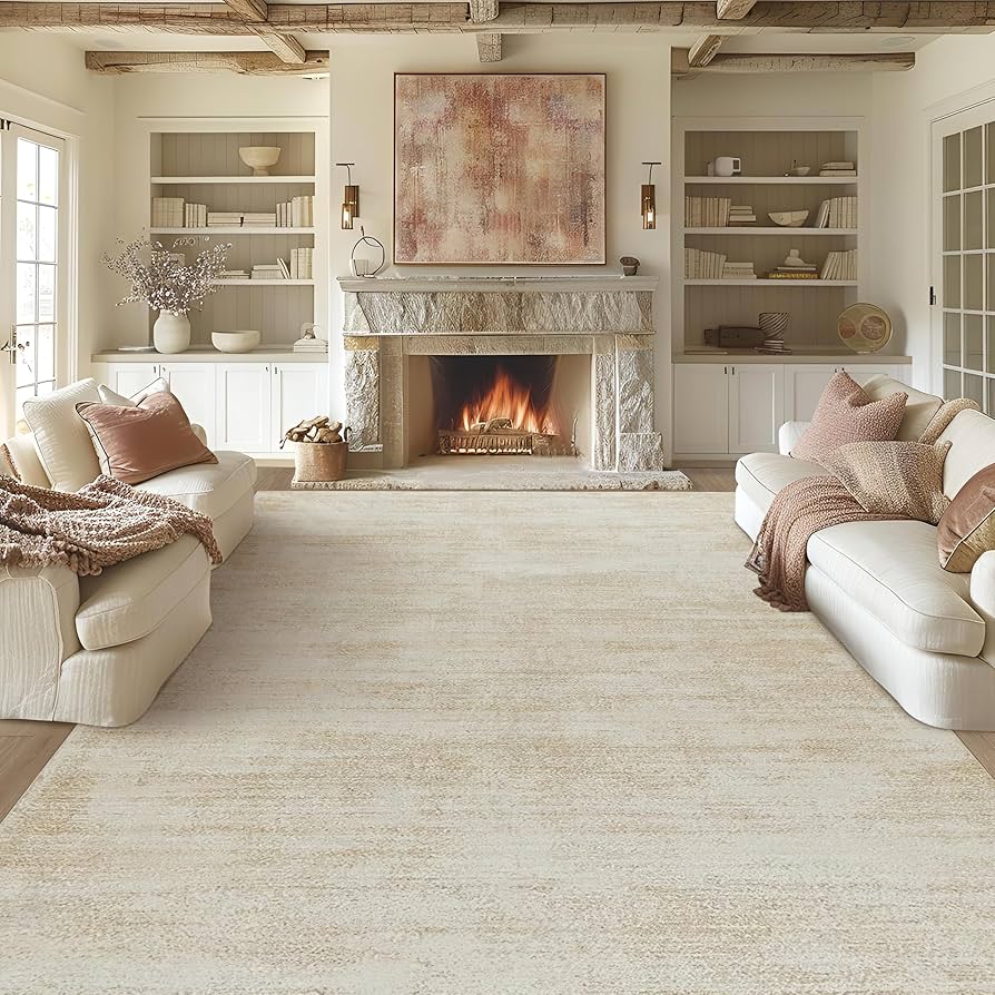
Neutral color schemes never go out of style because they offer a sense of calm, warmth, and flexibility. Shades like beige, cream, and taupe create a clean canvas that works with virtually any decor style—from traditional to contemporary. These tones naturally make a space feel open and airy, which is ideal for both large and small living rooms.
Classic neutrals are easy to layer with textures and materials to avoid looking flat or boring. Think soft linen curtains, cozy knit throws, and woven rugs to add dimension. You can also bring in pops of color through artwork, flowers, or seasonal accents for variety.
Neutrals are especially great for families or high-traffic areas because small marks and smudges tend to blend in rather than stand out. Plus, they age well over time, unlike trendier colors that can quickly feel outdated. To refresh the look, simply swap out your throw pillows or artwork—your foundation will remain timeless and adaptable.
Styling Tip: Use a mix of matte, glossy, and textured finishes (like velvet or wool) to create visual interest within the same neutral palette.
2. Black and White Elegance
A black and white color scheme is striking and sophisticated, offering a bold contrast that never feels outdated. It’s a high-impact palette that can be dressed up with glam touches or toned down for a modern minimalist vibe. This duo exudes timeless elegance and works beautifully in both classic and contemporary living rooms.
Balance is key to making this scheme work—too much black can feel heavy, while too much white can feel stark. Incorporate patterns like stripes, checks, or abstract motifs to add rhythm and personality. Brass or gold accents also pair beautifully with this combination, adding warmth and depth.
Another benefit of a black and white scheme is that it works well with almost any metallic—brass, chrome, gold, or matte black—all pair beautifully. You can easily introduce seasonal elements like red for the holidays or soft pastels in spring. Since this scheme is so refined, even small changes, like a new lampshade or abstract print, can make a big impact.
Styling Tip: Use black sparingly on accent walls, light fixtures, or trim to anchor the room without overwhelming it.
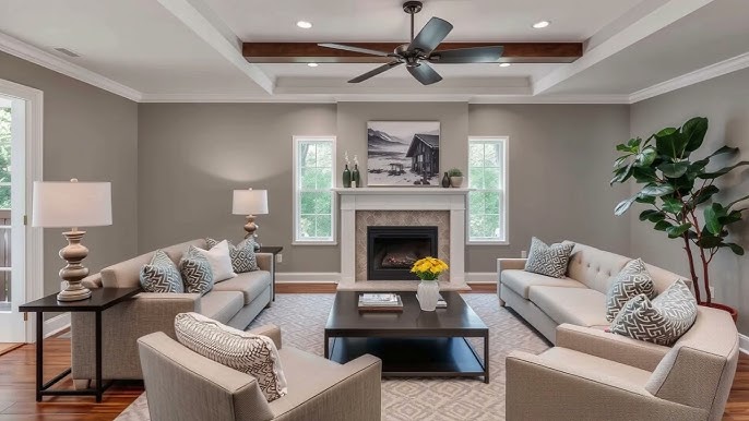
3. Soft Grays and Cool Tones
Soft gray is one of the most versatile colors you can use in your living room. It acts as a neutral but adds more dimension and depth than white or beige. When combined with cool undertones like blue or green, it creates a serene and contemporary atmosphere.
Gray is the perfect base for layering, whether you prefer a monochrome look or want to introduce accent colors. It pairs well with both warm and cool hues, giving you the freedom to update your space seasonally. Light gray walls with darker gray sofas and pale blue accessories can create a calm, cohesive space.
This scheme is also ideal for showcasing artwork, as the understated walls allow bold frames or colorful paintings to shine. It creates a serene background that enhances any decorative additions without competing for attention. Incorporating subtle metallic finishes like brushed nickel or pewter can also elevate the look with a modern touch.
Styling Tip: Add contrast with dark wood furniture or black fixtures to prevent a washed-out look.
4. Earthy Greens and Natural Tones
Inspired by nature, earthy green tones like sage, olive, and moss are timeless choices that feel soothing and grounded. These hues pair beautifully with natural materials like wood, leather, and stone. They work well in a variety of styles, from boho and farmhouse to Scandinavian and modern rustic.
Green has a calming effect that brings a touch of the outdoors inside, making it perfect for a relaxing living room. It also complements warm neutrals, so you can mix it with beige, ivory, or tan for a balanced palette. Add plenty of plants to emphasize the organic vibe and tie the look together.
These tones are easy to maintain and forgiving when it comes to dust and wear, making them great for everyday living. You can also layer various shades of green together for a richer, more botanical effect. Try mixing matte green paint with olive-toned cushions and sage-hued pottery to create a harmonious yet visually interesting space.
Styling Tip: Choose a matte green wall paint and accent it with linen or rattan textures for an earthy, lived-in feel.
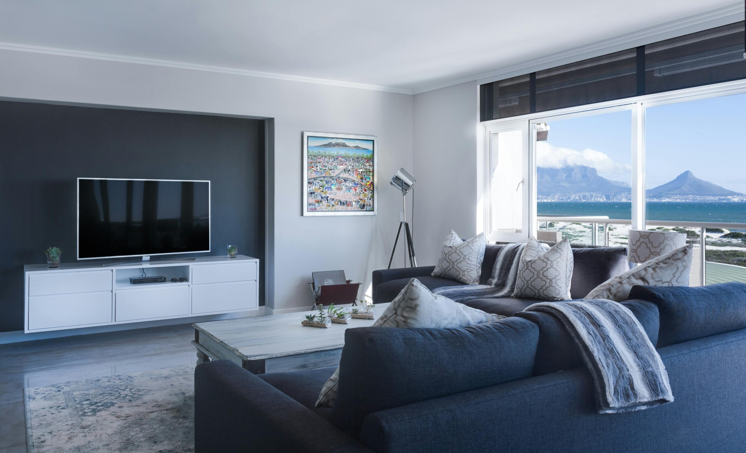
5. Navy Blue and White
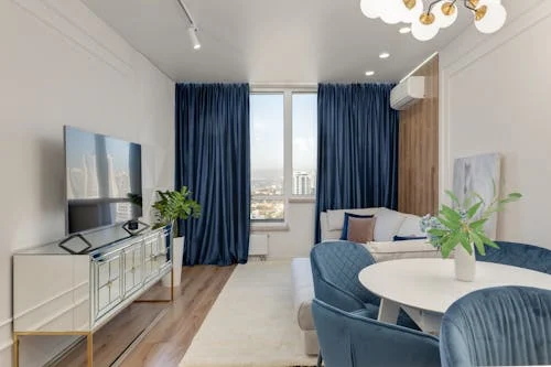
Navy blue and white make for a sophisticated and timeless pairing that feels both classic and contemporary. Navy adds depth and elegance, while white provides contrast and freshness. This combo is often used in coastal, preppy, or traditional design styles, but it can be easily adapted to modern spaces too.
Because navy acts almost like a neutral, it can be used in large doses without overwhelming a space. White trim, light-colored furniture, and brass or wood accents help soften the look and keep it from feeling too dark. Add in navy throw pillows or a patterned rug for balance.
The navy and white combo also works well with nautical, coastal, or even industrial decor elements, offering flexibility in your design approach. Add natural touches like jute rugs or woven baskets for a more relaxed, beachy feel. Or, introduce marble and chrome for a polished, high-contrast space with classic appeal.
Styling Tip: Use navy on a single statement wall or in upholstery to ground the room without closing it in.
6. Warm Terracotta and Cream
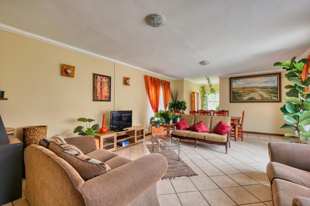
Terracotta is a warm, earthy shade that evokes a desert-inspired feel while offering timeless charm. When paired with creamy neutrals, it brings warmth and softness to your living room without overpowering it. This color scheme feels cozy, organic, and full of character.
Terracotta works beautifully with natural textures like clay pots, woven baskets, and rustic wood. Cream tones help lighten the overall look, making it inviting and balanced. This palette also complements global and southwestern decor for a relaxed, collected look.
This palette ages gracefully and hides minor blemishes well, making it practical as well as beautiful. Terracotta is especially striking in natural light, taking on richer hues throughout the day. Pair it with artisanal pieces—like handcrafted pottery or macrame—for a unique and timeless boho-inspired vibe.
Styling Tip: Try terracotta in small doses—think accent pillows, a rug, or an armchair—against cream-colored walls for maximum impact.
7. Monochrome Whites and Off-Whites
A monochrome white palette is a timeless favorite for making a space feel light, airy, and open. From crisp bright white to warmer off-whites like ivory and eggshell, the variation creates subtle dimension. It’s perfect for minimalist or Scandinavian-inspired living rooms.
This palette allows architectural details and texture to shine. Because there’s no strong contrast, focus on layering fabrics, patterns, and materials to prevent the space from feeling flat. Incorporate elements like boucle, fringe, or faux fur for softness and interest.
Because the palette is so light, even small touches of wood, stone, or greenery can have a major visual impact. This allows you to change the entire mood of your room with minimal effort or expense. For a more lived-in charm, consider incorporating vintage or distressed items that contrast with the clean color scheme.
Styling Tip: Use warm lighting (like soft LED bulbs) to keep an all-white room from feeling too cold or clinical.
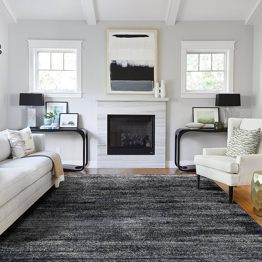
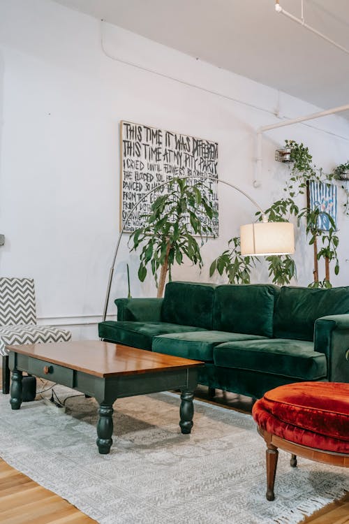
8. Moody Charcoal and Deep Tones

If you love a dramatic and intimate atmosphere, moody shades like charcoal, slate, and espresso are timeless and luxurious. These deep tones create a cozy, enveloping effect that works well in both modern and classic spaces. They add richness and personality without needing bright colors.
To balance the darkness, incorporate plenty of light sources and reflective surfaces. Light-colored or metallic decor—such as mirrors, lamps, or brass hardware—adds contrast and keeps the room from feeling too heavy. Moody tones also work well with plush fabrics like velvet or leather.
This rich palette lends itself beautifully to layered lighting, so be sure to mix overhead fixtures, floor lamps, and sconces. Doing so adds warmth and function while enhancing the dramatic effect. Consider painting the ceiling a matching tone or slightly lighter shade to create a cozy, cocoon-like effect.
Styling Tip: Add in greenery or light wood furniture to break up the darkness and inject natural warmth.
9. Soft Blue and Sand
Soft blue and sandy beige bring a coastal calm to your living room that feels relaxed yet polished. Inspired by the beach, this palette is refreshing, serene, and timeless. It’s especially ideal for homes looking to create a light, breezy vibe.
This color combo works well with driftwood, rattan, linen, and other natural textures. The blue provides a pop of color while still keeping things understated, and the sand tones act as a gentle neutral. Add touches of white or sea-glass green for a well-rounded coastal palette.
Because this palette is so naturally calming, it’s ideal for homes where relaxation is a priority. These hues also reflect light beautifully, making your space feel open and welcoming. You can easily adapt the look from casual to elegant by changing just a few elements, such as switching from cotton to silk throw pillows or adding a chandelier.
Styling Tip: Incorporate woven or whitewashed furniture and sheer curtains to complete the soft, beachy aesthetic.
10. Greige (Gray + Beige)
Greige combines the best of both worlds: the cool sophistication of gray and the warm comfort of beige. It’s a modern neutral that works beautifully in any lighting and pairs well with virtually any color. This balance makes it a staple in timeless, transitional living rooms.
Because it shifts in tone depending on the time of day and lighting, greige keeps your space visually dynamic. It’s versatile enough to support bold accent colors or stay entirely neutral. Whether on the walls or the furniture, it provides a subtle, stylish foundation.
Greige is also a favorite among interior designers because it adapts beautifully to both cool and warm color schemes. That means you can pair it with crisp white and navy for a coastal feel or with blush and brass for a soft, romantic look. It’s a smart base choice for homeowners who like to change their decor frequently without repainting walls.
Styling Tip: Accent greige with navy, black, or deep green for a modern edge, or soft blush and ivory for a cozy vibe.
Bonus Tips for Choosing a Timeless Color Scheme
When in doubt, lean toward colors inspired by nature—earth tones, sea blues, and sky grays all have lasting appeal. Instead of committing to bold hues on your walls or main furniture, incorporate them in accessories or art so they’re easy to swap out. Keep your base palette neutral and build in layers of color through rugs, pillows, curtains, and decor.
Conclusion
A timeless living room color scheme doesn’t mean playing it safe—it means choosing a palette you’ll love today, tomorrow, and five years from now. The 10 schemes above offer beauty, versatility, and longevity, making them perfect for any home. Whether you prefer light and airy or rich and moody, there’s a classic combo that suits your style.
Feeling inspired? Try one of these color palettes in your own space and share your transformation! And if you’re looking for more design ideas, don’t miss our post on “15 Living Room Accessories That Instantly Elevate Your Space.”